OVERVIEW
Context: For this project, the client goal was to increase the uptake of the BoothIQ app and to make the overall service usable, efficient and fun. In order to do so, we addressed the attendee onboarding experience and focused on streamlining it.
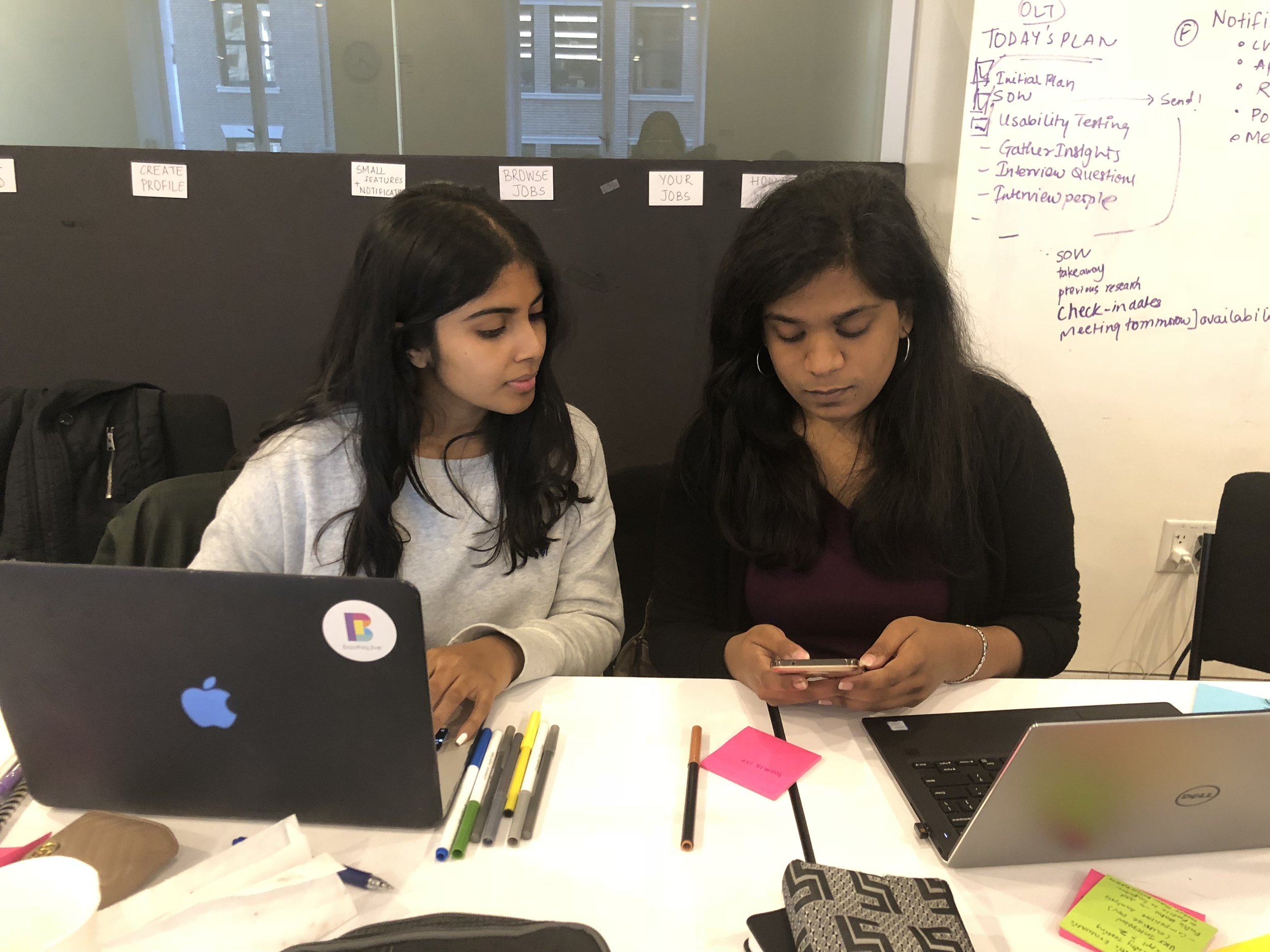
Team: 2 People.
Tools: Pen, Pencil, Paper and Figma.
BACKGROUND CONTEXT
What BoothIQ Does
BoothIQ is a web application that aids in bringing the best trade show experience for the attendees and the exhibitors. The attendees can enter a contest/save an offer through BoothIQ, and the exhibitors are able to collect 50% more leads through this application.
WORKFLOW
How We Spent Our Time
01 RESEARCH
Testing The Existing Interface
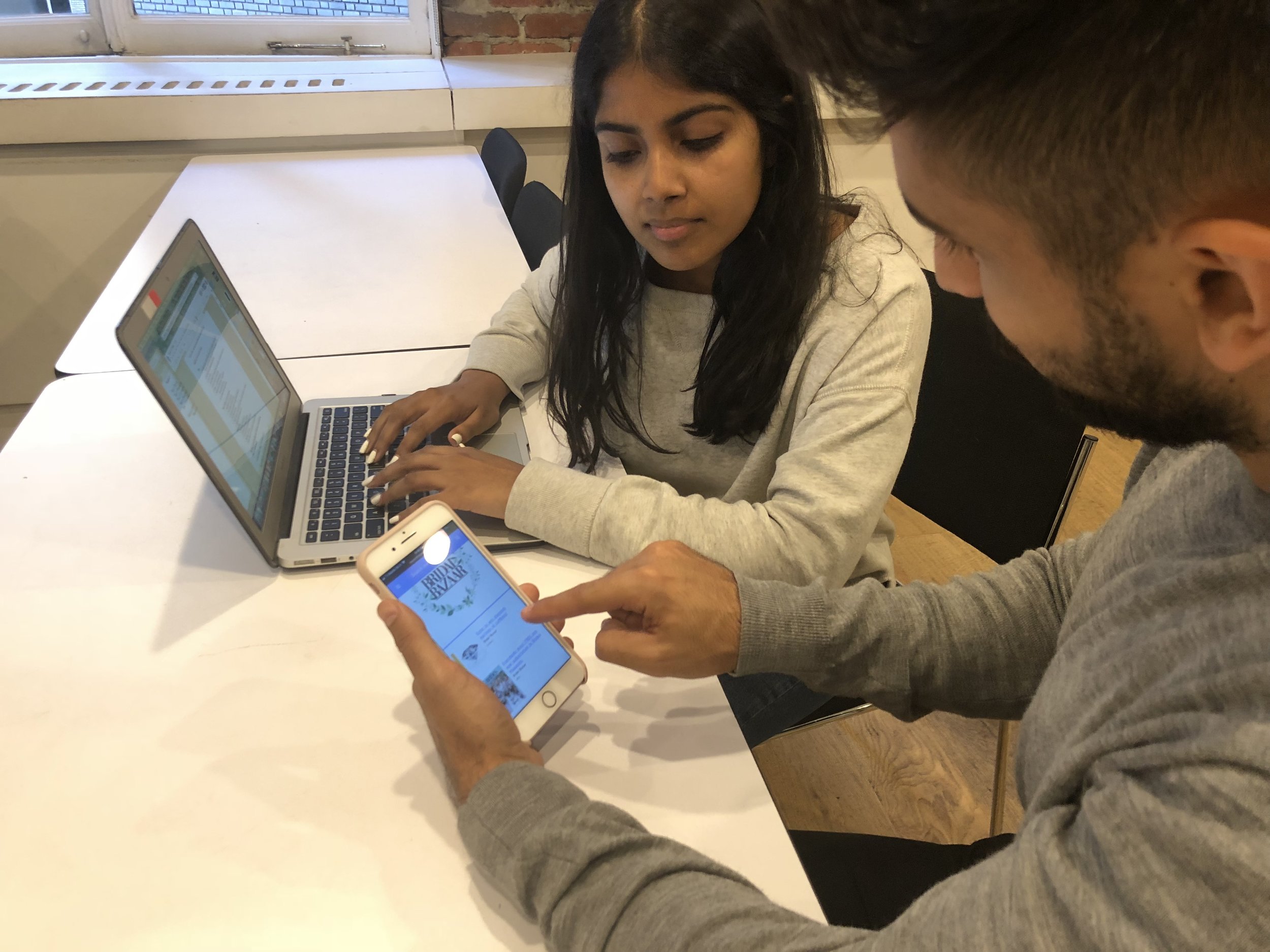
In order to understand the existing problems with the BoothIQ’s interface, we conducted usability testing with 5 participants. We observed and noted the their behavior, and encouraged them to think out loud during the entire process They were given the following tasks:
Signing in
Saving an offer or entering a contest
Checking their previous history (saved offers and contests)
Pinning a random company
RESULTS: The following table describes the task completion rates.
After that, we proceeded with Heuristic evaluation and examined the interface ourselves to see how it complied with the design principles. Some of the key takeaways:
Extra clicks raised problems with flexibility and efficiency
Inconsistency in terminology
Piecing It Together
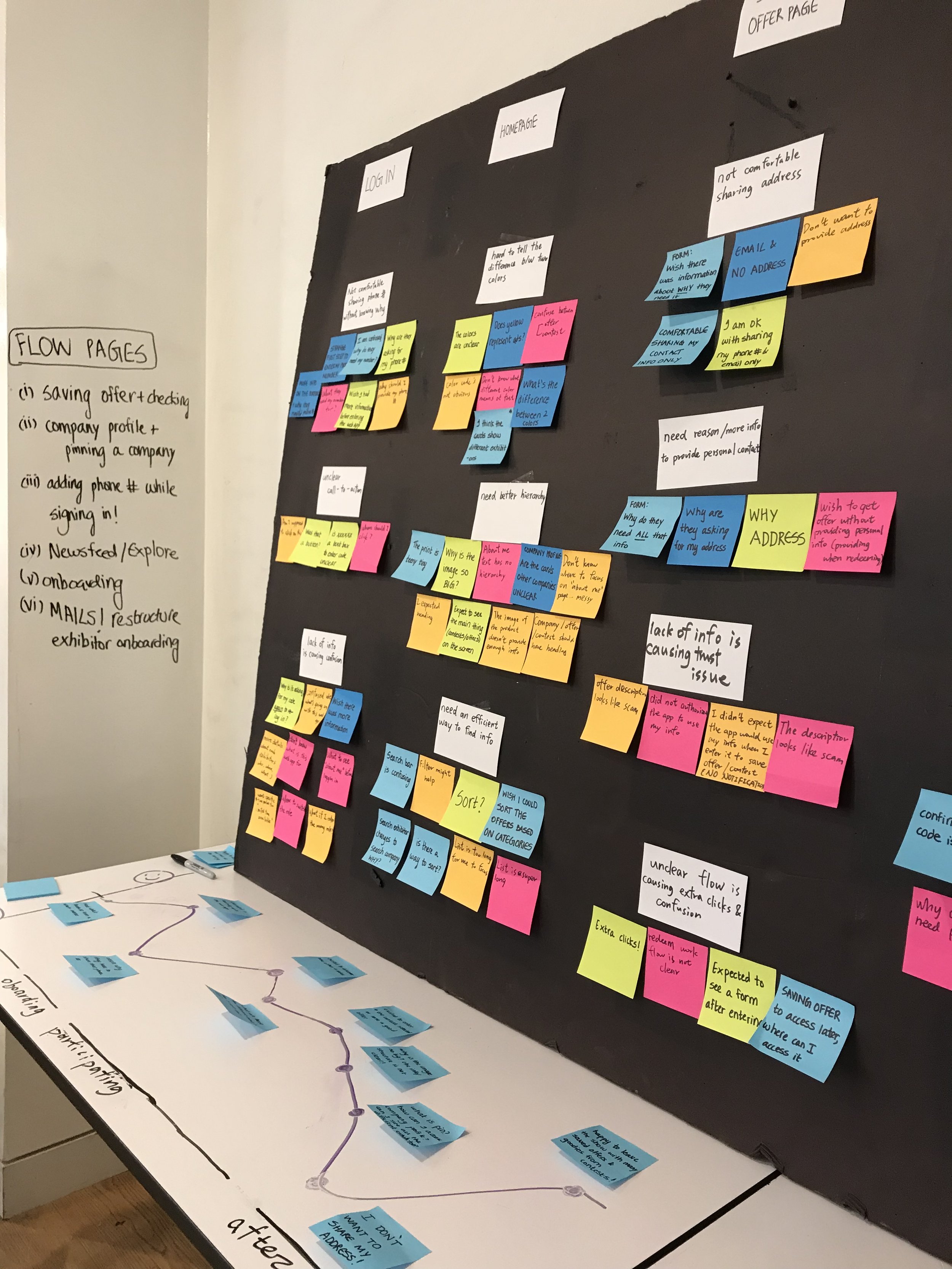
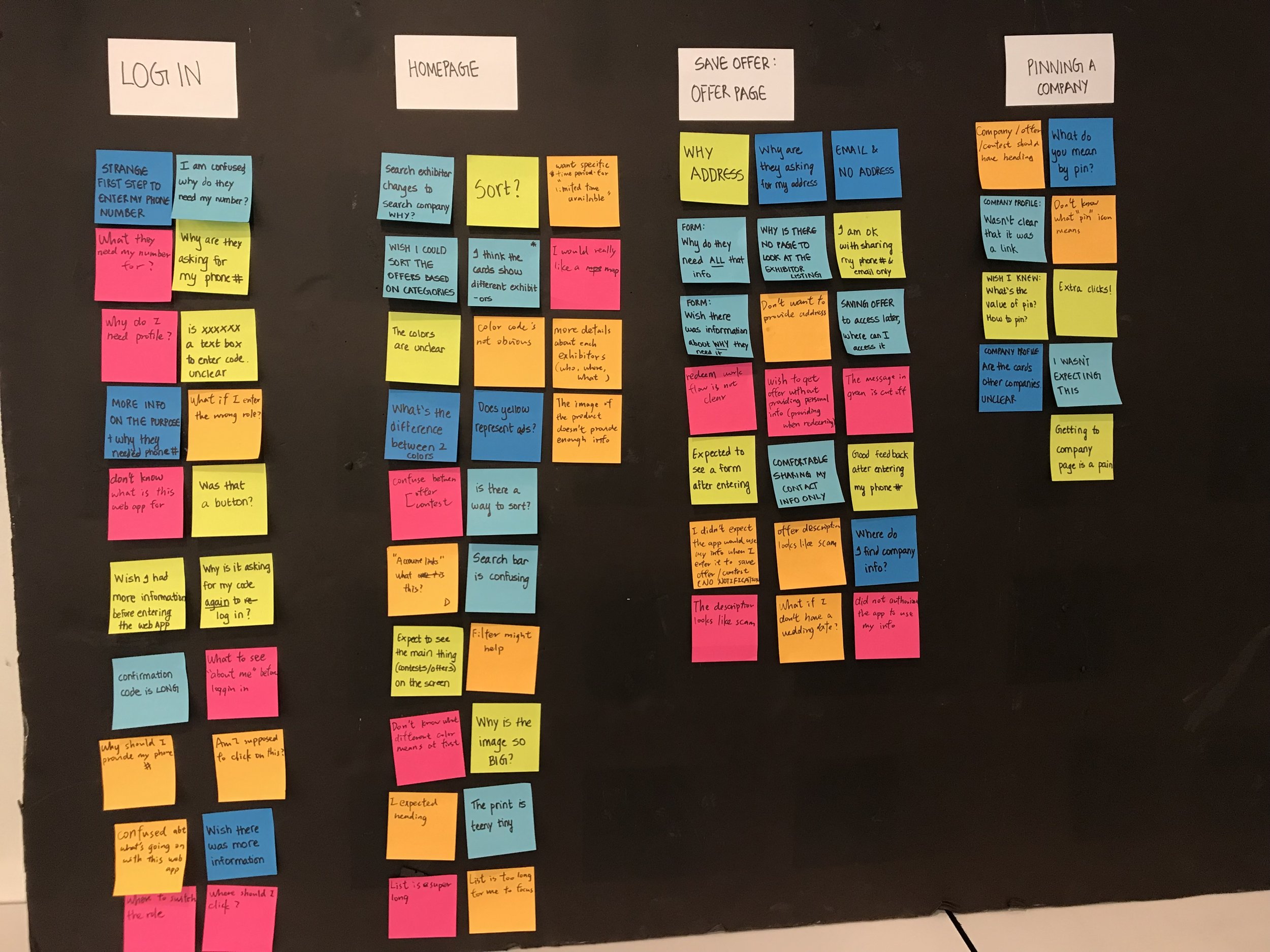
We grouped the data from usability testing and heuristic evaluation with the help of affinity mapping. We discovered the following trends:
UNCLEAR FLOWS & LACK OF INFORMATION
Homepage’s information lack of structure caused confusion between offers and contests
The flow for a few tasks was unclear, and because of this, users were taking extra time for simple tasks such as pinning a company
Users were not comfortable sharing personal information without knowing why it was needed (eg: phone number for onboarding — no information was presented as to why the attendees had to enter their phone number)
Lack of information/help during onboarding caused confusion and trust issues
How might we address these issues?
Need to implement better hierarchy of information that’s already there to enable users find what they are looking for effectively and efficiently.
Need to design a better flow to avoid extra clicks
Need to provide instructions (eg: what the phone number is being used for) and have better onboarding to encourage people to use BoothIQ without any confusion/trust issues
02 DESIGN
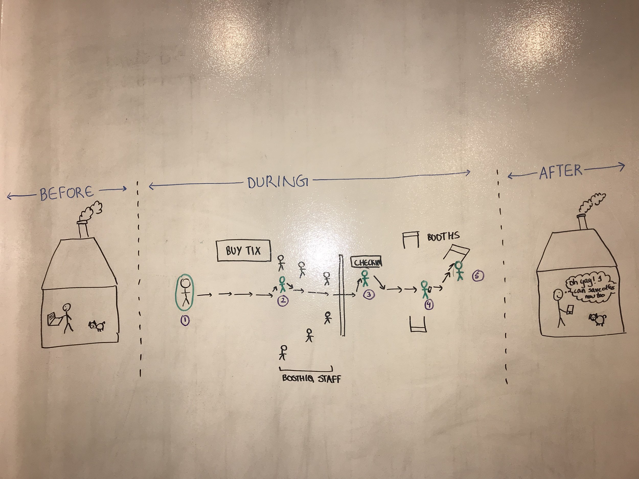
What the Attendee’s Journey Looks Like
Based on our research, we mapped the attendees experience to see where the major user pain points were occurring. We found that the major drop in emotional experience happens during the onboarding process since the existing app lacks tutorial and information. This helped us to focus our design on majorly on the attendee’s onboarding process.
Looking at it Holistically
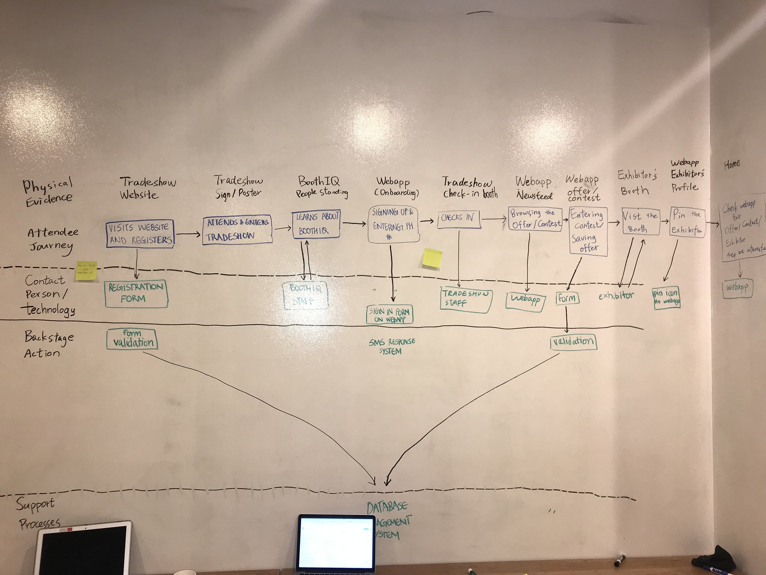
After figuring out user pain points, we wanted to look at the onboarding process from a holistic approach. Based on our conversations with out client, we sketched out a service blue print and realized that:
BoothIQ’s attendee onboarding was happening at the trade show
The onboarding was taking place before the trade show registration/check-in
How Might We Make it Better
The next step was to figure out the user flow that catered to a smooth onboarding process. We also went ahead and worked on user flows for other tasks and pitched them to the client. The new flows had fewer clicks and were more flexible. The flow pages that we worked on were:
Sign In Page
Saving an Offer/Entering a contest
Company Profile Page + Pinning a company
My profile page
Onboarding
After finalizing the flows with the client, we created a user flow for the proposed solution and encouraged onboarding to take place in multiple instances — before the trade show and during the trade show.
03 ITERATE & DEVELOP
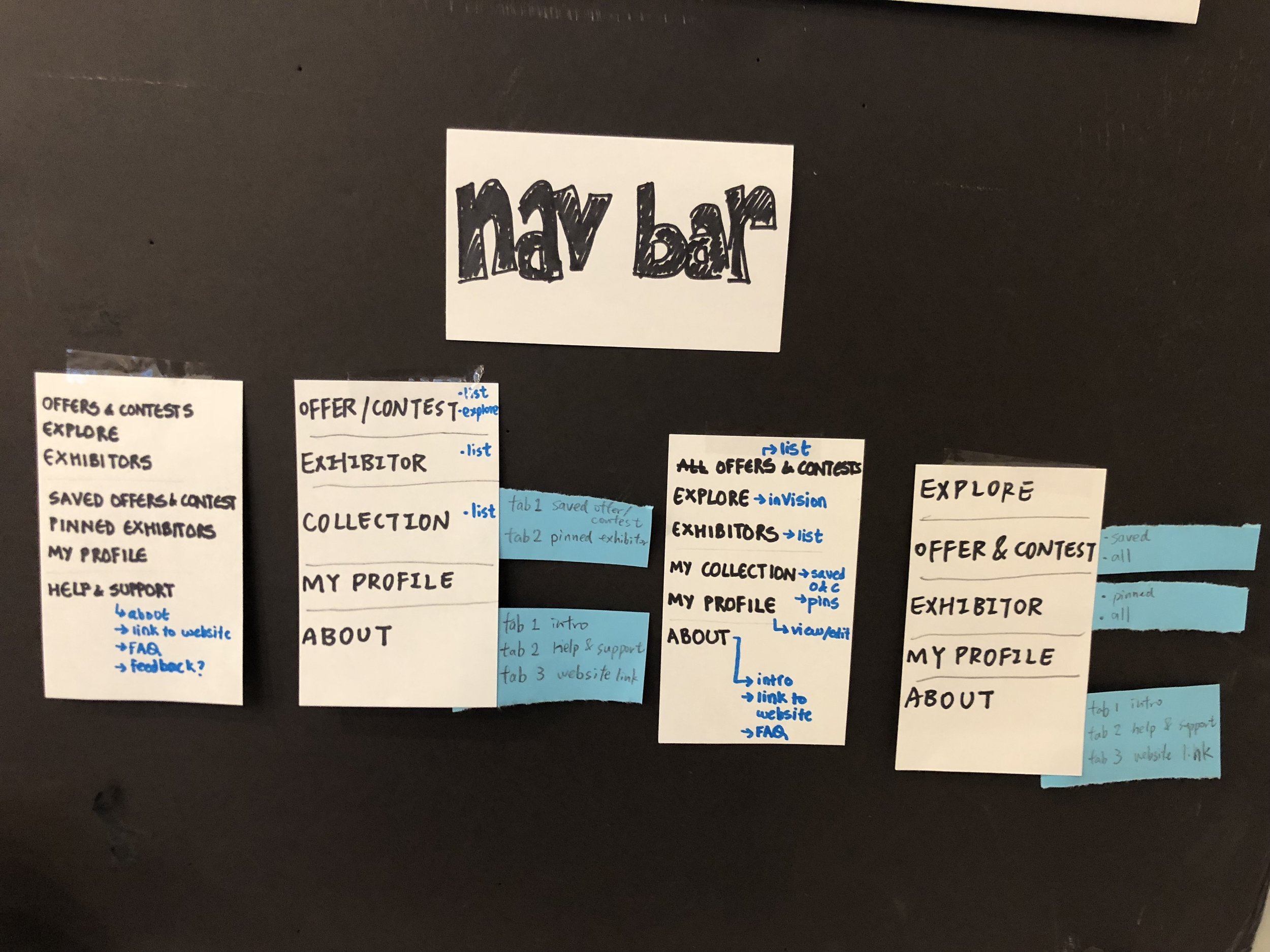
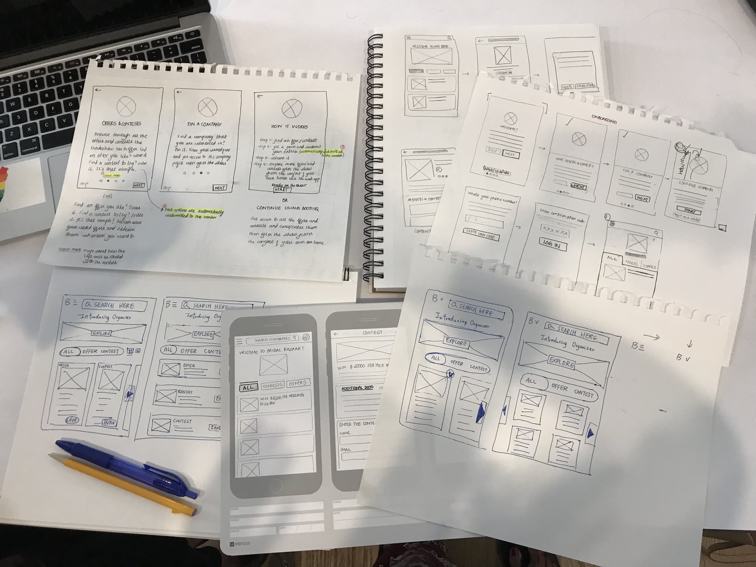
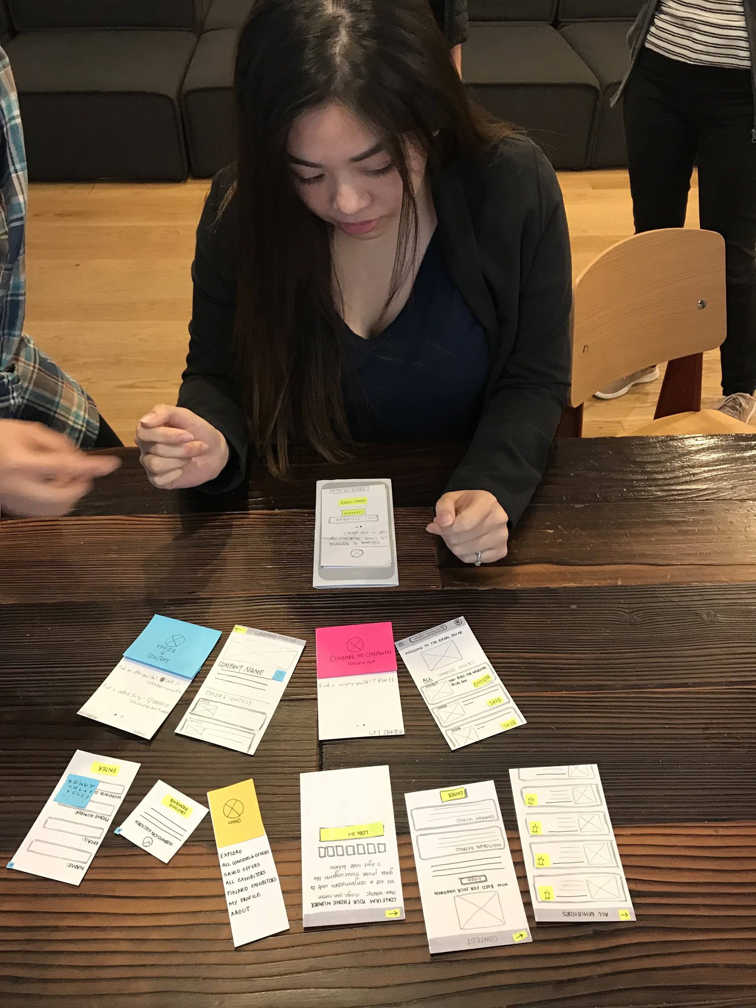
Through each step of our design iteration, we had the opportunity to meet the client and work together on those changes. Involving the stakeholder throughout the process was helpful since it gave us insight into how she wanted her brand to look and feel. We started off by sketching the interface of the hamburger menu and had a design studio with the client. We finalized on the one she saw was best fit, and then proceeded towards the onboarding tutorial.
These iterations helped us specifically to test out different onboarding flows and finally select the one that worked both for the client and the end users.
Key Screens
ONBOARDING
The attendees now have information as to why they need to provide their phone number, and the opportunity to “learn more”
NAVIGATION
Along with changing the terminology to maintain consistency, we also added “all exhibitors” and “explore”.
04 NEXT STEPS & STRATEGY
Problem Area: The onboarding takes place before checking-in for the trade show & causes long lines
How might we streamline the onboarding process outside the boothIQ web application? How can we decrease the lines and make this a seamless process?
QR Code
The client can use a QR code on BoothIQ’s promotional material (stickers, badges, posters) so that the attendees can get faster access to the Web Application.
Early Registration & Onboarding
The client can encourage trade show organizers to get their attendees registered with BoothIQ before the trade show.
Apart from the existing social media campaign, they can consider email campaign for early registration and onboarding.
